
A tale of two counties
A tale of two counties
Understanding the demographic and economic future of the Inland Empire

I mentioned in last week’s migration analysis that I would write a follow-up that focuses specifically on San Bernardino and Riverside Counties. I noted at the end of that post that there were some important differences between the two counties. Despite the fact that they are often on similar economic trajectories and are both considered part of the “Inland Empire”, demographically they have been at odds for some time now.
I am not the first to write about this. Back in November 2022, Jinghan Hu and Manfred Keil noted that Riverside County’s labor force has been growing faster than San Bernardino County’s(https://www.sbsun.com/2022/11/25/riverside-county-vs-san-bernardino-county-a-look-at-employment-and-the-labor-force/). If you go back to 2001, San Bernardino had a higher labor force than Riverside (from the context of this article, please note for the remainder of it, I am talking about the counties, not the cities). However, the two flipped in 2005. In the last 20 years, Riverside’s labor force growth rate has been twice that of San Bernardino’s. Today, Riverside’s labor force is estimated at 1.1 million; 1.0 million in San Bernardino.
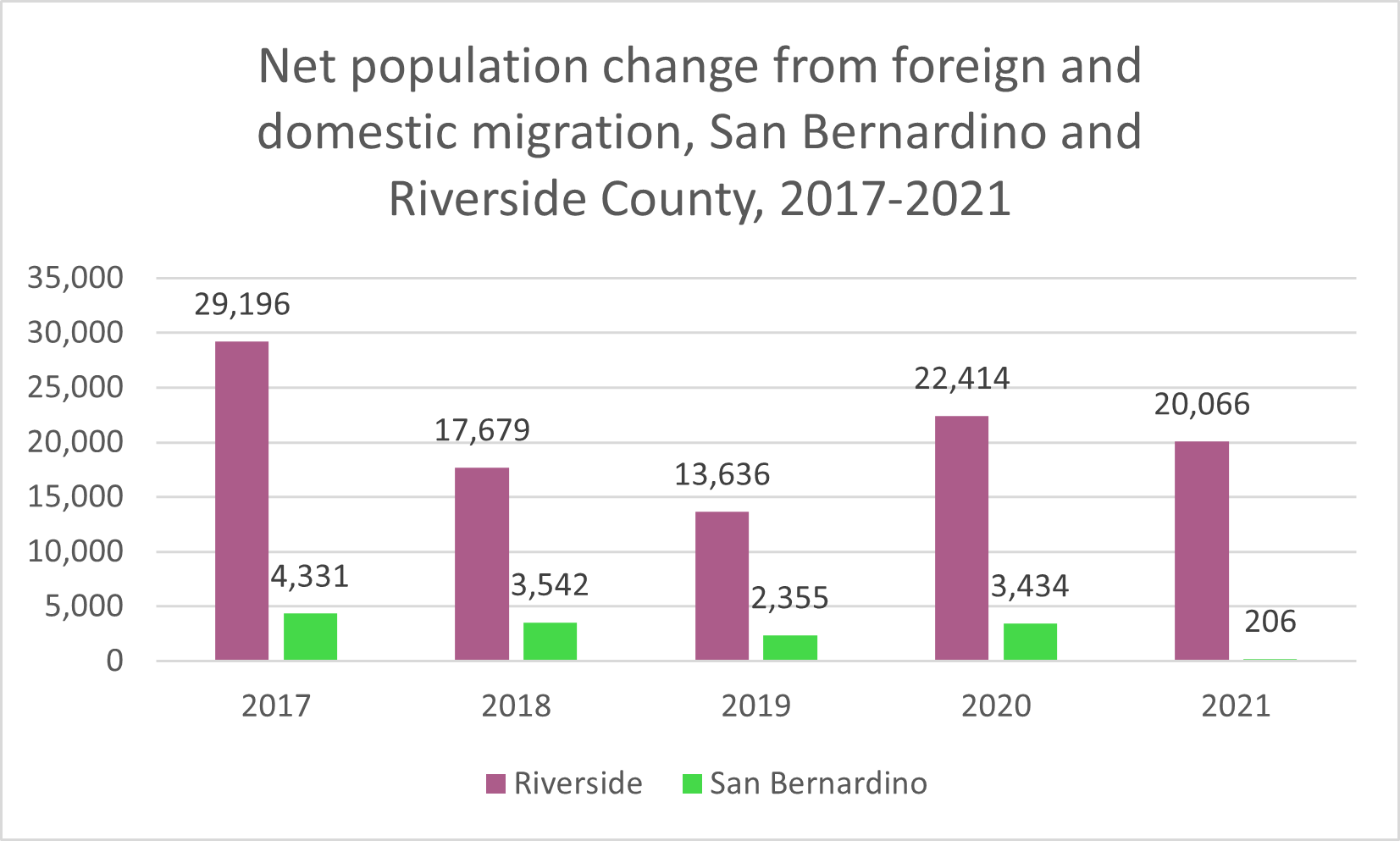
The chart above shows how migration trends are driving these statistics, pushing Riverside’s labor force consistently above San Bernardino’s. In general, over the last five years migration has brought in more people to Riverside than San Bernardino on net, but Riverside has also been trending upward on this metric, while San Bernardino is trending downward – towards the zero/negative domain. While both counties report positive population growth from migration, Riverside is clearly in a better situation than San Bernardino.
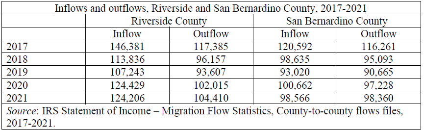
You can see from the above table that while outflows are similar in both counties, inflows have been larger in Riverside: in other words, Riverside is attracting migrants at a higher rate than San Bernardino, explaining the differences in the two counties. Back in 2017, total population outflows from San Bernardino and Riverside were 116,261 and 117,385 respectively, but inflows were 120,592 and 146,381 respectively. Fast forward to 2021 and it’s the same story: similar outflows, but higher inflows in Riverside. Accumulated over many years, this difference will create a significant advantage for Riverside.
Riverside is also attracting higher income households than San Bernardino, thus explaining how the former has a net positive gain in AGI while the latter has a net negative gain. In 2021, the average AGI of the in-migrating San Bernardino household was $55,000; the average AGI of the out-migrating San Bernardino household was $59,600. In Riverside, the numbers were $71,500 and $64,600 respectively. Thus, Riverside is and has been attracting more people, and higher-earning people, than San Bernardino.
Unfortunately, I don’t really know why this is happening. It’s possible that Riverside is more strategically located to the coastal MSAs: Riverside residents are potentially commuting to San Diego, Orange County, and Los Angeles, whereas San Bernardino residents mainly have Los Angeles and possibly Orange County as potential commuting points. This has always been true, but perhaps Riverside is benefitting at a greater rate from the growth of the coastal MSAs. Other than that, I don’t know what could be going on.