
The California Exodus is real and accelerating
The California Exodus is real and accelerating
While the numbers of people leaving the state may look small percentage-wise, the jumps we see in the data suggest more serious underlying issues

In April the IRS released their statistics of income – migration flow data for the 2020-2021 year. These data offer the most geographically detailed and reliable assessment of migration trends. They show that between 2020 and 2021, California lost 403,041 households and gained only 245,685 households. These statistics support the findings I reported on earlier (based on American Community Survey microdata), showing a negative outmigration of households and people from California.
There have been many reports on these data. See here for a piece in the local papers, and here for an article in Yahoo Finance. Jonathan Lansner also wrote about them for the local papers here. I want to highlight some of the issues mentioned in these articles - specifically, the debate about their general significance. Some believe the numbers are just a “drop in the bucket” and do not signal any serious underlying issues. However, I am not so sure.
In a future post, I’ll look more specifically at the Inland Empire. There are some interesting issues there as well.
First, what’s making the headlines: the statistics from the IRS show the total flows of “adjusted gross income” (AGI) – which anyone who files taxes knows about – between states. These numbers show the migration flows I just mentioned caused an outflow of $50.3 billion in AGI and an inflow of $21.3, for a net loss of $29.1 billion in AGI. In other words, migration is costing the state a lot of money!
The net loss in AGI of $29.1 billion outranks every other state in the U.S. The two other “big losers” on this front were New York – net loss of $24.5 billion – and Illinois – net loss of $10.9 billion. The big gainers were Texas (net gain of $10.9 billion) and Florida (net gain of $39.2 billion). The Yahoo finance article discusses this angle more in-depth.
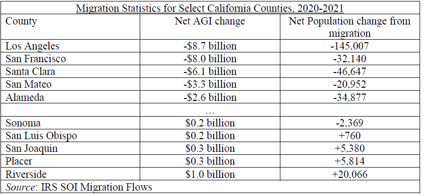
I dove into the county-level migration flows statistics to see who is driving these net negative outflows. Almost all the negative outflows of people and AGI are occurring in the big metro areas of San Francisco and Los Angeles. See the table below for the top 5 and bottom 5 counties by net AGI change.
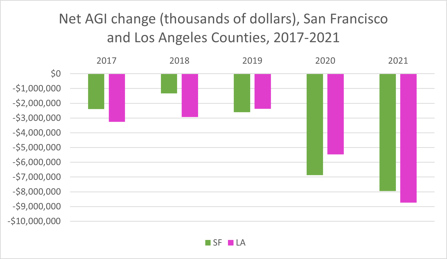
Some journalists, such as Jonathan Lansner, are hesitant to blame these numbers on bigger issues like politics or cost of living. To support his position, Lansner notes that these net outflow numbers are not that significant when considered as a whole. While it’s true that, percentage-wise, 200 thousand fewer households is small compared to a 30+ million population (and $30 billion is not much to a multi-trillion dollar economy), the trends are more worrying. Net AGI loss and loss to migration has increased dramatically over the past two years of IRS data, and as I mentioned before, my own analysis indicates that the state is increasingly losing higher educated people. These are signs of broader changes in the housing market and economy. See the chart below, which shows the yearly net AGI loss in San Francisco and Los Angeles Counties since 2017.
In a future article, I’ll look specifically at the Inland Empire. But you might have already noticed something from the table above - that unlike other parts of the state, Riverside is actually gaining AGI and population. The same cannot be said for San Bernardino. More on that in a future post.