The only chart you need to track the Inland Empire's Economic Recovery
The Bureau of Labor Statistics has unofficially released some of the February 2021 metro area employment numbers. The official release will be on Wednesday, April 7 and will include more information, including an official unemployment rate estimate for February 2020. You can find the data for the Inland Empire here.
The headline number is a 5.7% year-over-year decline in total nonfarm employment in the IE between February 2020 and February 2021. A few industries have done well through the pandemic. Trade, Transportation, and Utilities, which captures retail and logistics and composes about 30% of the region’s labor force, grew at an annual rate of +5.0% in February. But leisure and hospitality (which composes 8.8% of the labor force) was down 26.6% from February, and most other industries are still in negative territory as well.
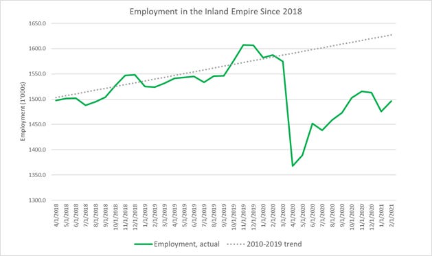
The real story here is how employment continues to be far below the pre-pandemic trend. The region’s labor market continues to recover at only a moderate pace. See the chart below, which illustrates the gap between actual and trend employment, and does a great job of visualizing the work that still needs to be done to get the labor market back in shape.
I constructed the gray dotted (trend) line by assuming a simple linear model of employment in the Inland Empire starting from 2010, marking the start of recovery from the Great Recession, up through 2019. It shows how the economy would have performed in the absence of the pandemic. The data are non-seasonally adjusted total (non-farm) employment for the Riverside-San Bernardino-Ontario metro area, from the Bureau of Labor Statistics.
The most disturbing thing about this chart is that the labor market continues to meander below the trend line, with no strong surge back to trend. We can only hope that the roll-out of more vaccine will finally provide that surge the labor market needs to get back on track.

