
Quits and layoffs data highlight changes in worker bargaining power at the state level
Quits and layoffs data highlight changes in worker bargaining power at the state level
A decline in worker bargaining power in recent months could be another sign of worsening labor market conditions

A few weeks ago I was listening to an episode of The Indicator podcast from NPR’s Planet Money (great episode! Check out the link). Labor economist Aaron Sojourner was on, talking about his own indicator which he calls the “labor leverage ratio” (“LLR”). The ratio is a way to measure the relative bargaining power of workers in the labor market.
The ratio takes the seasonally adjusted number of quits and divides it by the total number of layoffs and other separations. The data can be found in the BLS’ “Job Openings and Labor Turnover Survey”, link here.
If you quit your job, it’s more likely you have something else lined up – something, presumably, better than your current situation. On the other hand, if you’re laid off, that more likely comes as a surprise to you, and so you spend more time looking for a new job, possibly not on your own terms.
If the LLR – that is, the ratio of quits to layoffs – increases, the labor market is seen as more in workers’ favor. Suppose the ratio of quits to layoffs is 0.5: this means for every 1 quit reported in the labor market, there were 2 layoffs. If the ratio of quits to layoffs rises to 3, that means for every 3 quits, there was just 1 layoff. That’s a better situation for workers.
In the early months of the pandemic, the labor leverage ratio dropped really low, highlighting how workers had little control over their situation. Almost all the pandemic-related unemployment came from layoffs rather than from quits. See the chart below, which shows the LLR for California since 2016. I pulled data from the BLS’ JOLTS survey, specifically seasonally adjusted quits divided by seasonally adjusted layoffs and other discharges statewide.
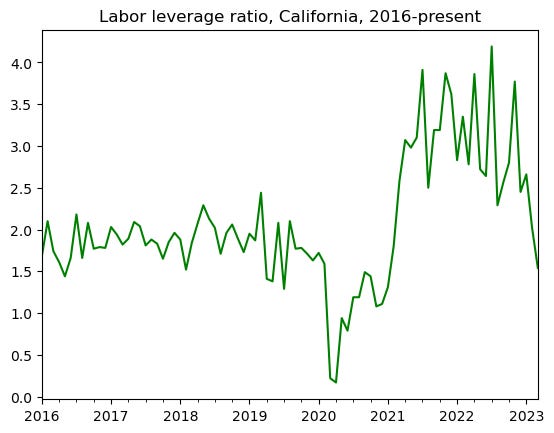
See the chart: after the initial plunge, as we moved through the second half of 2020, the labor leverage ratio recovered and returned to normal levels. However, it was clear by early 2021 that labor market conditions were swinging in the other direction: by mid-2021, the LLR was at a 20-year high, with an average of 3.5 quits per 1 layoff through the rest of 2021 and 2022.
What does the LLR ratio look like today? You’ll see in that chart that it moves sporadically, but since the beginning of 2023, there certainly appears to be a downward trend, meaning that workers are losing the higher-than-average bargaining power they enjoyed in 2021 and 2022.
Consistent with the chart above, Jonathan Lansner had an article in the OC Register/SB Sun (also a great piece! Check out that link) published on May 18 highlighting an increase in layoffs in California. He mentioned that layoffs are at a 27-month high and have increased rapidly in recent months. That is certainly in line with the drop in the LLR since 2023, and mirror national trends.
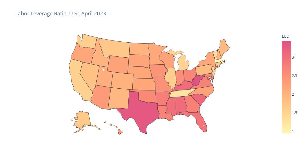
To gain a macro-level picture, see the map above which plots the LLR for all states as of April 2023. This is a static map; if you’d like to see a dynamic map where you can hover over individual states to check their values, click here (link will be live for 2 months; contact me if you have any problems accessing it). This map shows that the LLR is highest in Southern/Southeastern states, suggesting labor market conditions are more favorable for workers in those states.