
On new UI Claims and unemployment rates: what does one say about the other?
On new UI Claims and unemployment rates: what does one say about the other?
A nerdy, technical post on how to get up-to-date data

With all the uncertainty surrounding the economy these days, it’s important to get a pulse on current conditions. Data from the BLS are released at somewhat of a delay, but that is not the only source of regional labor market data. California’s Employment Development Department releases weekly data on new Unemployment Insurance (UI) claims – applications for unemployment insurance when workers are laid off and searching for a new job. Further, these data are released at the county level and even include breakdowns by industry. They are an excellent source of information on current conditions, and they provide unparalleled insight into the labor market.
I used UI claims data in a recent post on the unemployment situation. There, I mentioned that UI claims have inched up slightly in recent weeks. If this continues, then it’s likely that it will translate into a higher unemployment rate reading for March and April – even though we won’t know for sure, because of data release lags, for several weeks.
My question for today’s post is, how closely are UI claims and the unemployment rate related to each other? For example, how sure can we be that if UI claims go up, the unemployment rate will go up as well?
It turns out that there is a strong correlation between these two variables. In order to estimate the relationship, I did the following:
For each county, UI claims data are released by the CA EDD for each week in a given month. The weekly data are released for “the week ending on” a given Wednesday or Thursday in a given month. Thus, there are either 4 or 5 data points for each month. I collected these datapoints for San Bernardino County and averaged them across each month back to February 2020. I did not include Pandemic Unemployment Assistance claims in my averages.
I then collected the non-seasonally adjusted unemployment rate for San Bernardino County from the BLS LAU series
Finally, I produced an overlaid plot of the two time series – see below:
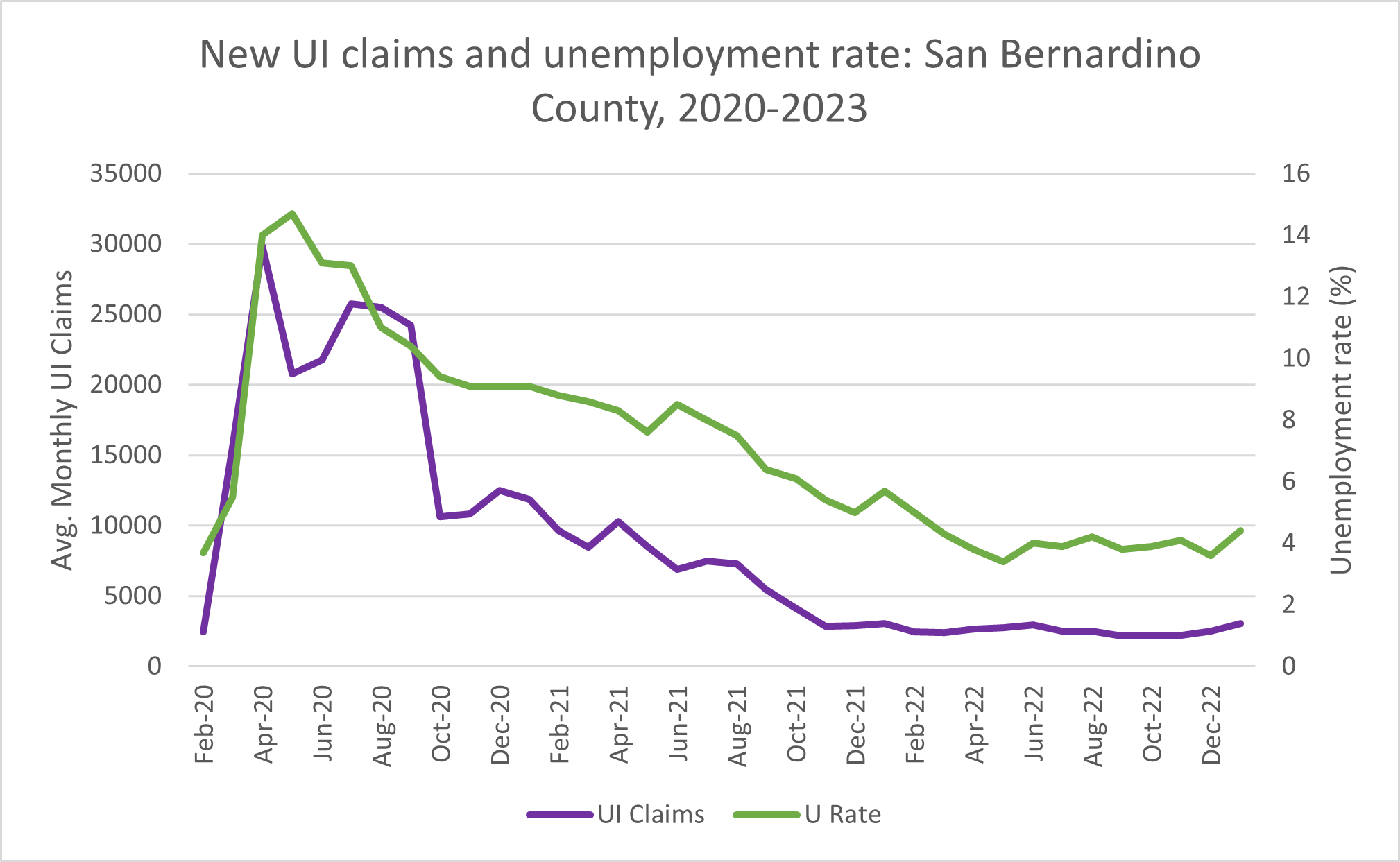
The overlaid plot shows a very strong relationship between the two series. A correlation coefficient based on these data produces a value of 0.90, which is a strong correlation. The correlation coefficient can take on a value between -1, 0, and 1, with numbers closer to -1 or 1 indicating a stronger (negative or positive respectively) correlation and numbers closer to 0 indicating a weaker (negative or positive) correlation.

To see if there was a better correlation between previous month UI claims and current month unemployment rate, I calculated the correlation between a 1-month-lagged version of UI claims with unemployment rate. However, the correlation I calculated in that case was slightly lower than a simple contemporary correlation.
I conclude that the contemporary correlation works best and suggests that using UI claims can be an excellent way of getting an early reading on where the unemployment rate will be headed.
Thanks Daniel for this interesting post, and for sharing these insights.